
Why It Matters for Your Website’s Success
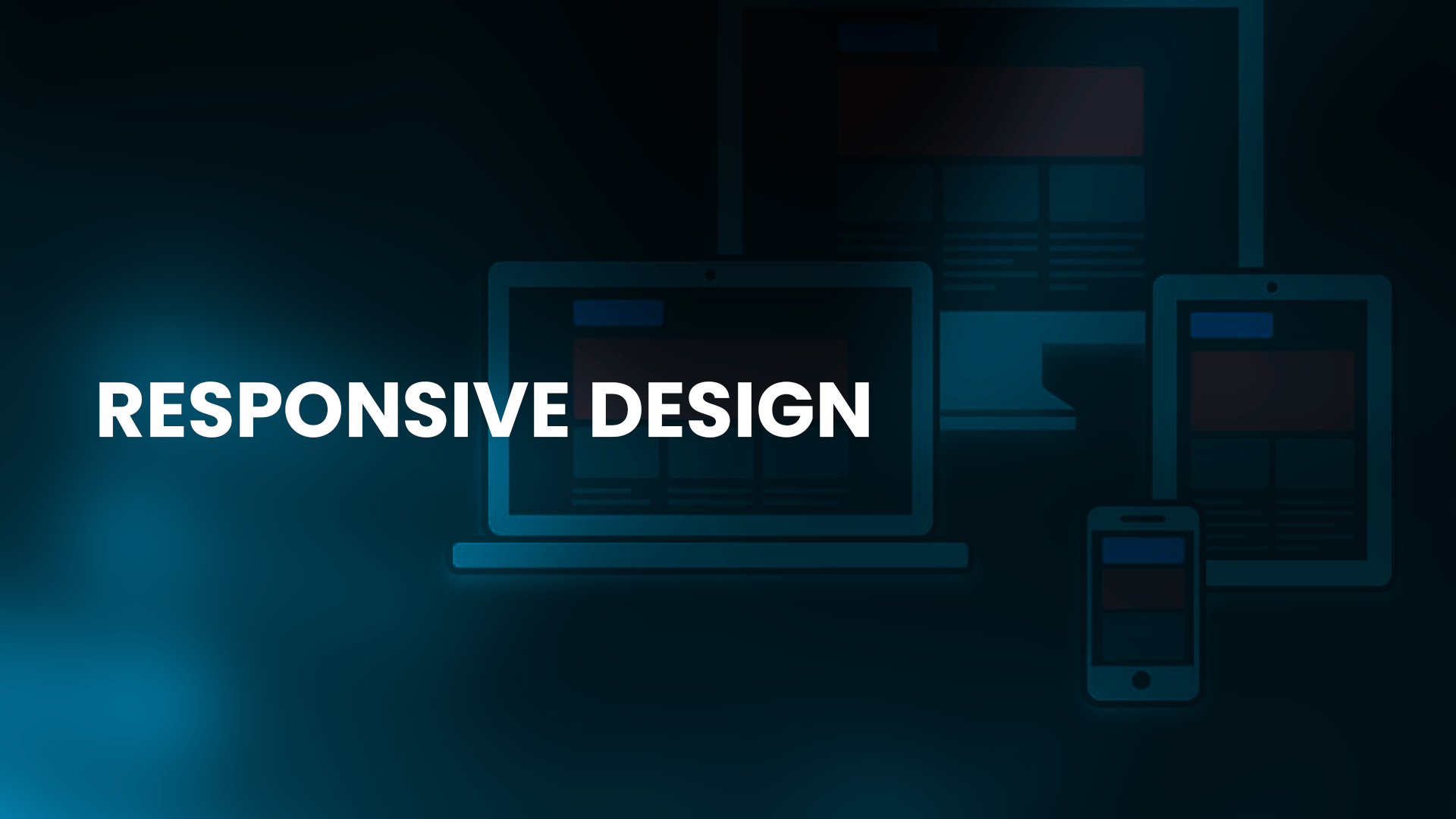
Responsive design is a critical element of modern website design. In today’s mobile-first world, users expect websites to be accessible and easy to use on any device, from desktop computers to smartphones and tablets. Responsive design ensures that a website’s layout and content adjust automatically to the user’s screen size and orientation, delivering a seamless user experience regardless of the device.
In addition to improving user experience, responsive design can also boost a website’s search engine rankings. Google’s algorithm prioritizes mobile-friendly websites in search results, meaning that businesses without responsive websites may be missing out on valuable traffic and leads. Responsive design can also improve a website’s load times, which can further enhance user experience and search engine rankings.
At Smart X, we understand the importance of responsive design for a website’s success. Our team of designers and developers are experts in creating responsive websites that are optimized for both user experience and search engine performance. By partnering with Smart X for your website design needs, you can ensure that your website delivers the best possible experience to your users, no matter what device they’re using.